
Using color theory in your home interiors helps you create spaces that feel balanced, inviting, and expressive of your personality. By understanding how colors evoke emotions—like blues for calm or reds for energy—you can choose schemes that support your daily routines. Combining complementary, monochromatic, or analogous colors lets you craft harmony or vibrancy. Mastering these principles guarantees your home feels cohesive and inspiring; explore further to discover how to make every room truly reflect your style.
Key Takeaways
- Use color psychology to select hues that promote desired moods, like calming blues or energizing reds.
- Develop cohesive color schemes such as monochromatic, complementary, or analogous for visual harmony.
- Light colors can make spaces appear larger, while dark shades create intimacy and depth.
- Balance bold and neutral tones to prevent visual chaos and ensure a pleasing environment.
- Consider how color combinations influence room perception, functionality, and emotional ambiance.
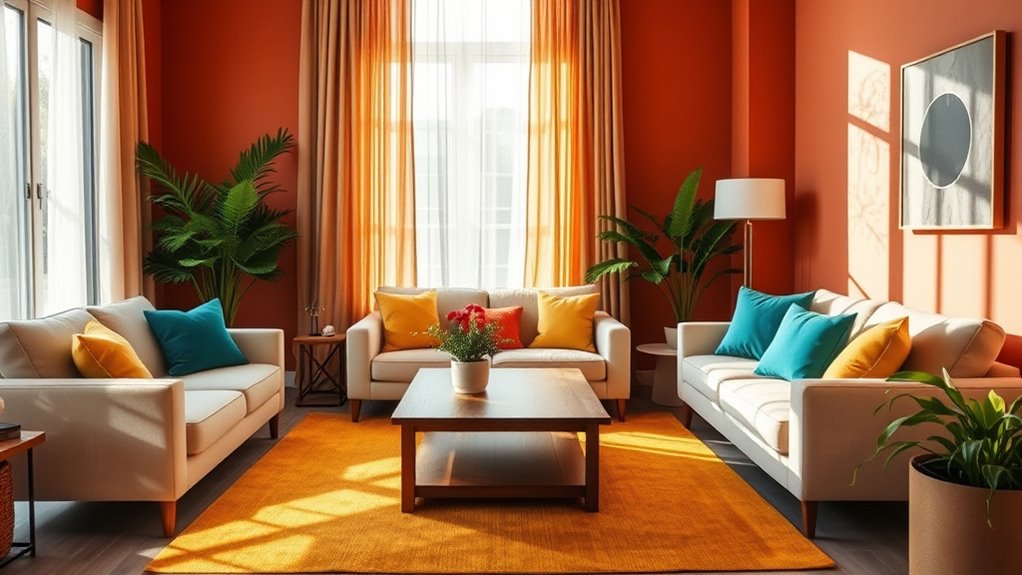
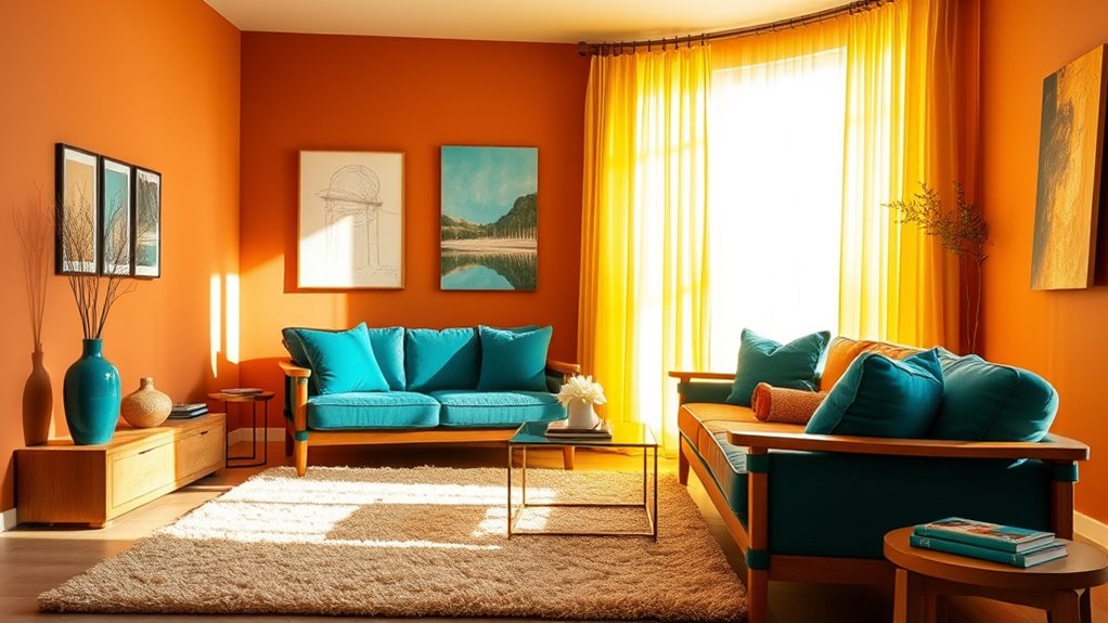
Understanding color theory is essential when designing your home interiors, as it helps you create spaces that feel balanced, inviting, and visually appealing. When you grasp how colors influence emotions through color psychology, you can intentionally select hues that promote relaxation, energy, or focus, depending on the room’s purpose. For example, blues and greens tend to evoke calmness and serenity, making them ideal for bedrooms or living rooms where you want a peaceful atmosphere. Conversely, warmer shades like reds and oranges can energize a space, perfect for kitchens or workout areas. Recognizing these emotional effects allows you to craft environments that enhance your mood and well-being.
Color psychology guides your home’s mood—calm blues or energetic reds shape your space’s atmosphere.
Equally important is understanding how to develop effective color schemes. A well-chosen color scheme guides the overall look and feel of your home, creating harmony and coherence across different rooms. Monochromatic schemes, which use variations of a single hue, offer a sophisticated and calming appearance, ideal for minimalist or modern designs. Complementary schemes, pairing colors opposite each other on the color wheel, add vibrancy and contrast, making spaces lively and dynamic. Analogous schemes, combining neighboring colors, produce a harmonious and cohesive vibe, suitable for creating cozy, inviting rooms. By thoughtfully selecting color schemes, you ensure that your interior design feels intentional and visually pleasing.
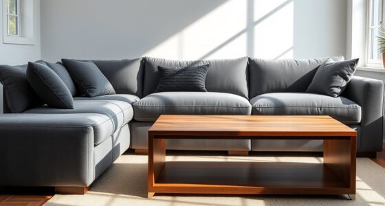
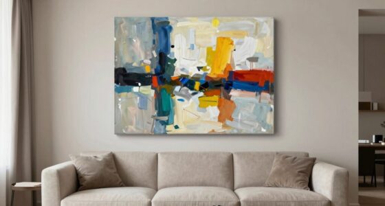
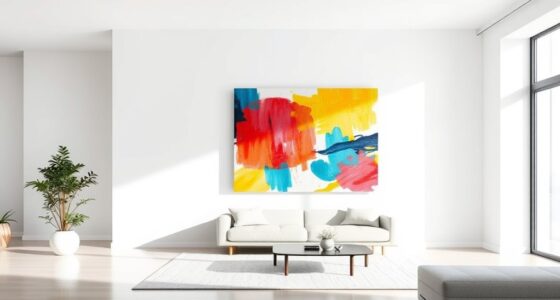
You should also consider how different color combinations influence the perception of space. Light colors tend to make rooms appear larger and more open, which is helpful in small or narrow spaces. Darker hues can add depth and intimacy, making a large room feel more cozy and inviting. When choosing your palette, think about the mood you want to evoke and how the colors interact with each other. Incorporating accent walls or accessories in contrasting colors can add visual interest without overwhelming the space. Remember, balance is key—too many bold colors can feel chaotic, while too many neutral tones might seem dull. Striking the right balance with your chosen color schemes will help you craft interiors that are both beautiful and functional. Additionally, understanding how color patches can be used in design allows you to add unique focal points and texture to your interiors.
Ultimately, understanding color psychology and mastering the art of color schemes gives you the power to shape your environment intentionally. When you choose colors thoughtfully, you create a home that reflects your personality while supporting your daily routines. Whether you prefer tranquil blues or energetic reds, the right combination of hues can transform your spaces into places where you feel comfortable, inspired, and at ease.
Frequently Asked Questions
How Do I Choose Colors for Small Rooms?
To choose colors for small rooms, opt for light, neutral shades to create a sense of openness. Use color contrast thoughtfully; darker accents can add depth without overwhelming the space. Incorporate wall textures, like subtle patterns or matte finishes, to add visual interest without shrinking the room further. Keep the palette simple and cohesive, making sure the colors complement each other and enhance the room’s natural light.
What Colors Are Best for Bedrooms to Promote Relaxation?
You should choose soft, calming colors like blues, greens, or lavenders for your bedroom, as they promote relaxation through color psychology. Opt for color coordination by pairing these shades with neutral tones to create a serene atmosphere. Avoid bold, stimulating hues like reds or bright oranges, which can hinder relaxation. By selecting soothing colors and balancing them well, you’ll craft a peaceful retreat perfect for rest and rejuvenation.
How Do Lighting Conditions Affect Color Choices?
Lighting conditions can totally change your room’s vibe, making colors pop or fade away. Natural light floods your space, making bright or warm hues look even more vibrant, while artificial lighting can cast shadows or dull colors if not chosen carefully. You need to contemplate both, because your room’s colors will look completely different at sunrise than under cozy, yellow-toned lamps at night. Adjust your choices to match these lighting shifts for perfect harmony.
Can Color Schemes Influence Mood and Productivity?
Yes, your color scheme can influence your mood and productivity through psychological effects and color psychology. Bright, energetic colors like yellow or orange can boost motivation and creativity, while calming shades like blue promote focus and relaxation. By choosing colors intentionally, you shape your environment to support your emotional well-being and work habits, making your space more conducive to positive feelings and efficient productivity.
How Do I Balance Bold and Neutral Colors in One Space?
You can balance bold and neutral colors by using an accent wall or color blocking. For example, paint one wall a vibrant hue to create a focal point, while keeping the rest of the room neutral. This approach adds visual interest without overwhelming the space. Incorporate neutral furniture and accessories to ground the bold colors, ensuring a harmonious, inviting environment that feels lively yet balanced.
Conclusion
As you step into your beautifully curated space, let the colors whisper stories of comfort and elegance. Imagine soft hues wrapping you in warmth or bold shades energizing your mornings. With a thoughtful palette, your home becomes a canvas reflecting your personality—calm lakes, fiery sunsets, or lush gardens. Embrace the power of color theory, turning every room into a harmonious sanctuary where your senses are gently awakened and your spirit feels truly at home.