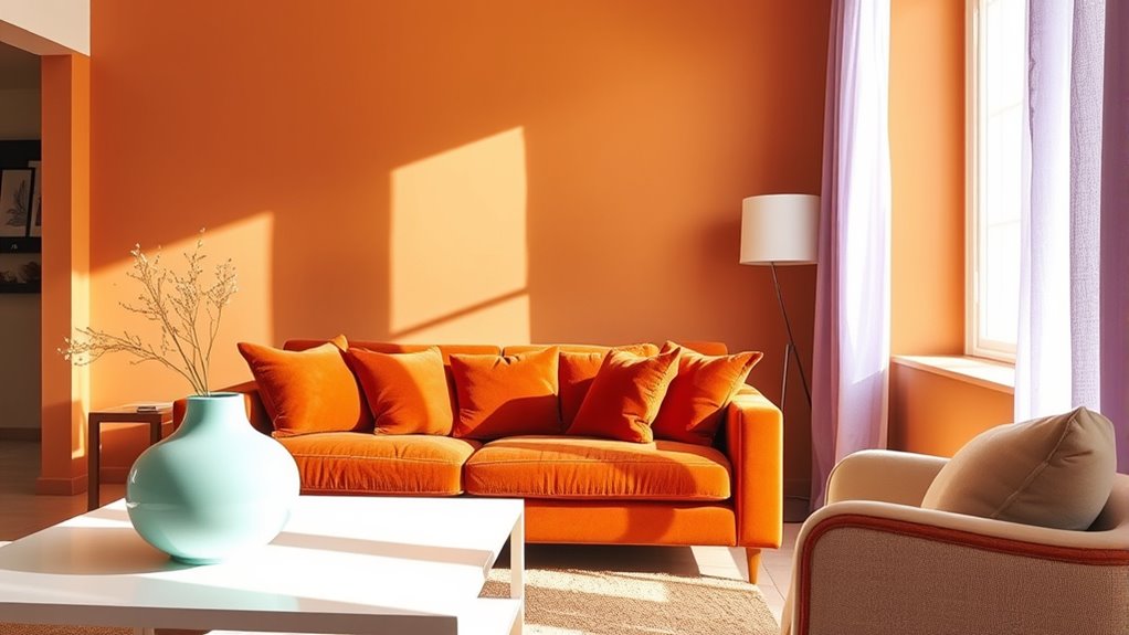

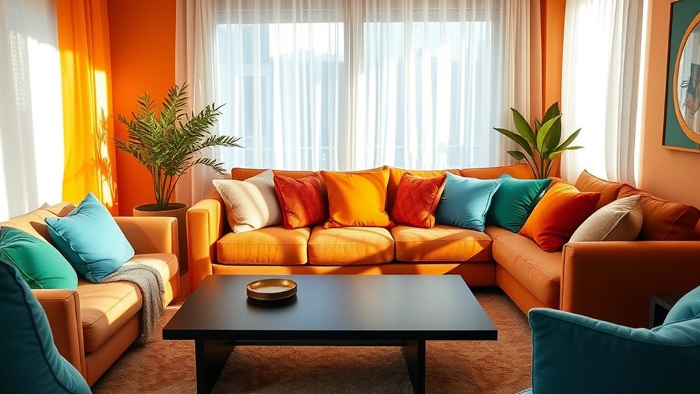
To set the mood in every room, choose colors intentionally based on how you want to feel. Bright hues like yellow and orange energize, while soft pastels create calmness. Cool colors such as blue and green promote relaxation, and warm tones like red and yellow boost creativity. Light shades make spaces feel open, and darker colors add intimacy. Understanding color psychology helps you craft environments that support your emotions—stay tuned to discover how to apply these ideas effectively.
Key Takeaways
- Choose bright colors like yellow and orange to energize spaces and boost motivation.
- Use soft pastels and neutrals to create calming, relaxing atmospheres.
- Incorporate cool shades such as blue and green to promote tranquility and stress reduction.
- Apply warm tones like red and yellow to enhance creativity and a sense of warmth.
- Consider cultural and personal preferences to select colors that positively influence mood.
Have you ever wondered how the colors around you influence your feelings and behaviors? It’s fascinating to realize that the hues in your environment can shape your mood and even your actions. When you choose colors for a room, you’re not just picking aesthetics; you’re setting an emotional tone. Bright colors like yellow and orange can energize you, making a space feel lively and stimulating. Conversely, softer shades such as pastels and neutrals tend to create a calming atmosphere, helping you unwind after a hectic day. Recognizing this power allows you to harness it intentionally, transforming any room into a space that supports your desired mood.
Colors influence your mood and actions — choose them wisely to create spaces that energize or calm you.
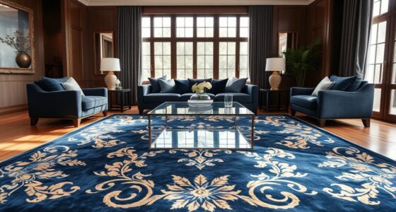
Think about your living room or bedroom. If you want to encourage relaxation, opting for cool colors like blues and greens can make a significant difference. These shades are associated with tranquility and balance, helping to reduce stress and promote restful sleep. On the other hand, if you’re aiming for a space that sparks creativity or motivation, incorporating warmer tones like reds and yellows can stimulate your mind and inspire action. When you understand these associations, you can craft environments that boost your well-being and productivity.
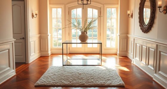
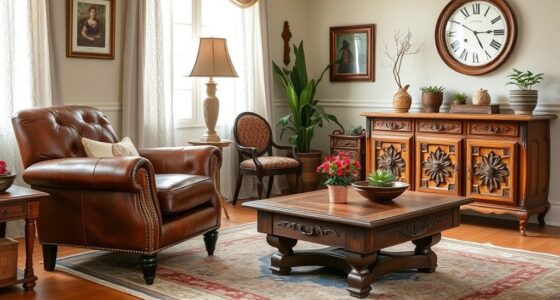
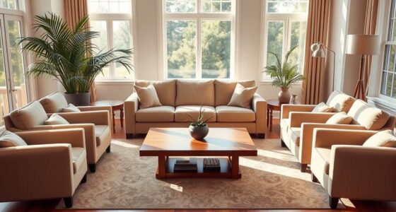
Color psychology also plays a role in how you perceive a space’s size and atmosphere. Light colors tend to make rooms feel more open and airy, which is perfect if you want to maximize a small area. Darker shades, however, add depth and intimacy, making a room feel cozy and inviting. By selecting the right colors, you can manipulate the perceived dimensions of your space to match your needs. If you feel your room is too stark or uninviting, adding accent colors can introduce warmth and personality without overwhelming the overall design.
Another aspect to think about is how personal preferences and cultural associations influence your response to colors. While some people find yellow uplifting, others might associate it with caution or anxiety. Similarly, red might energize one person but feel aggressive to another. Being mindful of your reactions and cultural context helps you choose colors that truly resonate with you. This awareness ensures your environment supports your emotional health rather than inadvertently causing discomfort or stress.
Understanding the role of attention in creative practice can also shed light on how focused effort enhances your ability to select and combine colors effectively. Ultimately, understanding the psychology of colors empowers you to create spaces that reflect your personality and serve your emotional needs. Whether you’re redesigning a room or simply adding small touches, mindful color choices can profoundly impact your mood and behavior. By intentionally selecting hues that align with your goals—calmness, energy, focus—you set the stage for a more harmonious and fulfilling environment. Recognizing the influence of color isn’t just about aesthetics; it’s about shaping a space that nurtures your mental and emotional well-being every day.
Frequently Asked Questions
How Do Color Choices Affect Productivity in Home Offices?
Color choices considerably impact your productivity in a home office. Bright, energizing colors like yellow or orange can boost your motivation and creativity, while calming shades like blue or green help you focus and reduce stress. By selecting the right colors, you create an environment that enhances your work efficiency and keeps you engaged. Remember, the right hues can make your workspace more inviting and conducive to getting things done.
Which Colors Are Best for Calming Children’s Bedrooms?
You should choose soft blues, gentle greens, or calming lavenders for children’s bedrooms. Studies show these colors can reduce anxiety and promote relaxation, helping kids sleep better and feel more peaceful. Bright, intense colors may overstimulate them, making it harder to settle down. By opting for soothing shades, you create a tranquil environment that supports restful sleep and a calm, happy mood for your children.
Can Color Schemes Influence Sleep Quality in Bedrooms?
Yes, color schemes can influence your sleep quality in bedrooms. Soft, muted tones like blues, greens, and lavenders promote relaxation and help you unwind before bed. Bright or overly stimulating colors can make it harder to fall asleep. By choosing calming hues, you create a peaceful environment that encourages restful sleep. Pay attention to your personal preferences, and combine colors with gentle lighting for the best results.
How Do Cultural Differences Impact Color Psychology?
You might think color psychology affects everyone the same way, but cultural differences greatly influence how colors are perceived. For example, white symbolizes purity in Western cultures, yet in some Asian cultures, it’s linked to mourning. You should consider cultural context when choosing colors, as what feels calming or energizing in one culture could evoke entirely different emotions elsewhere. This awareness helps you create spaces that resonate with diverse cultural backgrounds.
What Are the Latest Trends in Color Combinations for Living Rooms?
You should consider trending color combinations like deep blues paired with warm neutrals or soft pastels mixed with bold accents. Incorporate contrasting shades to create visual interest, and experiment with muted tones for a calming atmosphere. Using metallics or textured finishes adds sophistication. Stay updated by browsing design magazines or social media for fresh ideas, and remember to choose colors that reflect your personality and make your space feel inviting.
Conclusion
By understanding color psychology, you can transform any space into a sanctuary that perfectly reflects your mood and personality. The right hues can boost your energy, calm your nerves, or inspire creativity—all within a single room. Think of your space as a blank canvas, waiting for your unique touch to turn it into a masterpiece. So, don’t underestimate the power of color; it’s your secret weapon to creating an environment that feels just right—like magic, but real.