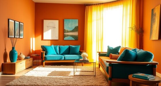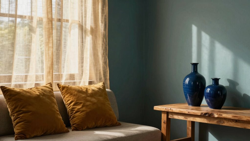
To mix warm and cool tones without clashing, start by choosing a dominant color that sets the mood, then add accents in contrasting but complementary shades. Balance saturated hues with softer, muted tones to prevent overwhelm, and use textures or materials to help blend the colors seamlessly. Consider your lighting to enhance the harmony and adjust your palette accordingly. If you keep exploring, you’ll discover even more tips to create stylish, cohesive spaces.
Key Takeaways
- Use muted or toned-down shades of warm and cool colors to prevent overwhelming contrast.
- Balance dominant warm and cool tones with neutral or subdued hues for harmony.
- Incorporate textures and materials to visually soften or enhance color interplay.
- Consider lighting conditions to adjust and complement the warmth or coolness of tones.
- Apply the principles of color theory, such as complementary or analogous schemes, for cohesive blending.
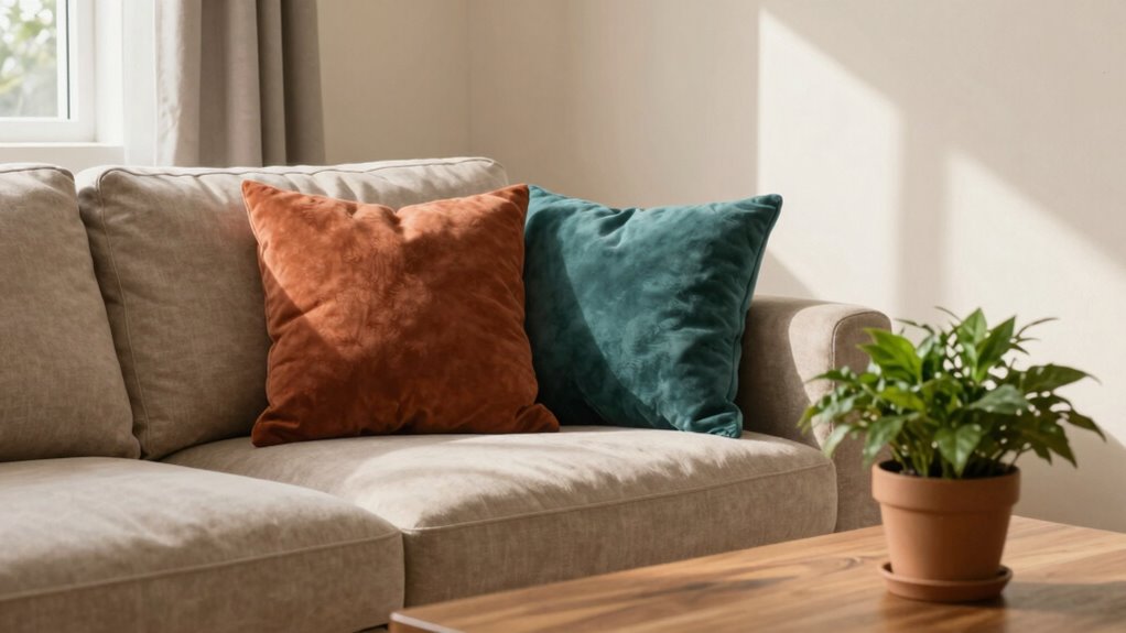
Blending warm and cool tones can transform any space or design into a balanced and inviting environment. When you understand the basics of color theory, you gain the tools to create harmony instead of chaos. Warm tones—think reds, oranges, and yellows—bring energy and coziness, while cool tones—like blues, greens, and purples—offer calmness and serenity. The key to mixing these effectively lies in understanding how they complement each other and maintaining interior balance. You want to avoid clashing colors that jar the eye or make a space feel disjointed.
Blending warm and cool tones creates balanced, inviting spaces filled with harmony and visual interest.
Start by considering the dominant color in your room. If you prefer a lively, energetic atmosphere, opt for warm hues as the main palette and add cooler accents. Conversely, if you lean toward tranquility, choose cool tones as the foundation and sprinkle in warm accents for visual interest. This approach keeps your space cohesive and prevents any one color from overpowering the others. Use color theory as your guide—colors opposite each other on the color wheel, like blue and orange, naturally create contrast and vibrancy, but you need to balance them carefully to prevent discord. For example, pairing a muted orange with a soft blue can produce a sophisticated contrast without feeling chaotic.
Achieving interior balance also involves considering the saturation and brightness of your colors. Bright, saturated hues demand more visual weight, so if you’re working with bold warm tones, temper them with softer, cooler shades. Conversely, a muted, cool color can serve as a calming backdrop that allows warmer accents to pop. Think of it as a visual conversation—each tone should complement and enhance the other, rather than compete. Incorporating textures and materials can further balance your color scheme; matte finishes can dull intense colors, while glossy surfaces reflect light and add depth, making the shift between warm and cool tones more seamless. Additionally, understanding the role of lighting in color perception helps ensure your chosen palette remains harmonious throughout the day. Proper lighting also emphasizes the contrast and harmony between your tones, enhancing the overall aesthetic. Recognizing how lighting influences color perception allows you to adjust your palette for different times of day and lighting conditions. Incorporating color psychology can also help you select tones that evoke specific moods and feelings, ensuring your space aligns with your desired atmosphere.
Finally, don’t forget lighting. Natural light enhances the warmth or coolness of your colors, so consider how your space receives sunlight throughout the day. Adjust your palette accordingly—what looks great in daylight might need tweaking under artificial light. When you approach mixing warm and cool tones with intention, guided by color theory and an eye for interior balance, you’ll create spaces that feel both lively and serene, attracting comfort and harmony in every corner.
muted warm and cool tone paint samples
As an affiliate, we earn on qualifying purchases.
As an affiliate, we earn on qualifying purchases.
Frequently Asked Questions
Can Warm and Cool Tones Be Used Together in Home Decor?
Yes, you can use warm and cool tones together in home decor. To make it work, focus on creating a balanced color temperature contrast, which adds depth and interest. Incorporate seasonal color pairing by switching warm and cool accents to reflect the time of year. Keep a consistent style and thoughtfully distribute the colors throughout the space, ensuring they complement each other rather than clash.
How Do I Choose the Right Balance of Warm and Cool Colors?
Think of balancing warm and cool colors as a dance where harmony is key. Use color theory to guide you—combine warm neutrals with cool accents, or vice versa, to create a cohesive look. To enhance mood, consider your space’s purpose, blending these tones thoughtfully. Start with a dominant color, then add smaller pops of the opposite to keep the balance lively without overwhelming.
Are There Specific Color Combinations That Clash More Often?
Certain color combinations, like highly contrasting complementary color pairings, can clash if not balanced carefully. For example, pairing bright orange with vivid blue might feel jarring, but using monochromatic schemes or muted tones can soften the contrast. To avoid clashes, choose complementary pairs with subdued shades or blend warm and cool tones within a neutral palette. This approach helps create harmony without overwhelming your space or outfit.
Can Warm and Cool Tones Be Mixed in Clothing Styles?
Yes, you can mix warm and cool tones in clothing styles. To achieve color harmony and guarantee style compatibility, balance your outfit by pairing one warm and one cool color, like a navy blazer with a burnt orange scarf. Use neutral shades to unify the look, and keep the proportions balanced. This approach helps prevent clashing and creates a cohesive, stylish appearance that highlights your fashion confidence.
What Accessories Help Blend Warm and Cool Color Schemes?
Your accessories can be the magic that blends warm and cool tones seamlessly. Prioritize jewelry pairing with mixed metals like gold and silver, which naturally bridge the color divide. Incorporate accent pillows in your space that feature both warm and cool shades, creating harmony effortlessly. These small touches work like a visual glue, making your overall look or decor feel balanced and cohesive without clashing, even when tones seem worlds apart.
color wheel art prints for interior design
As an affiliate, we earn on qualifying purchases.
As an affiliate, we earn on qualifying purchases.
Conclusion
Think of warm and cool tones as two dancers in a graceful ballet, each bringing their unique rhythm. When you blend them thoughtfully, they create a harmonious performance that’s lively yet balanced. Just like a well-choreographed dance, your space or outfit can become an engaging story where contrasting colors complement each other perfectly. Embrace the dance, trust your instincts, and let your style be the rhythm that binds everything beautifully together.
texture and material decor accents
As an affiliate, we earn on qualifying purchases.
As an affiliate, we earn on qualifying purchases.
adjustable lighting for room harmony
As an affiliate, we earn on qualifying purchases.
As an affiliate, we earn on qualifying purchases.